


Thailand
Royal Island Tour
From $1499
Visit The
East Coast Shores
From $1799
Northern Italy
Shores and Cities
From $3299
Historical
Downtown London
From $1199
Visit The
Italian West Shores
From $2799
Relax In
The Virgin Islands
From $1999
Sightsee
In Lovely Paris
From $2599
Get Away
In Alberta Canada
From $2099
Visit Our Top Resorts
Info Slide
- Details
- Created on Sunday, 12 May 2013 03:38
Javascript Version
CSS Version Default

CSS Version 1
CSS Version 2
CSS Version 3
Example Slide
CSS Version 4
Example Slide
How To Setup the Search Box and Menus
- Details
- Created on Sunday, 12 May 2013 03:37
1. Search Setup

- Simply publish the default Joomla search module to the search position.
2. Column Menu Setup

- Publish any menu module to the main body module positions on your site.
- There should be no menu style suffixes applied under advanced parameters.
- The menu style should be set to list.
3. Bottom Menu Setup

- Publish any menu to the 'bottom_menu' position.
- There are no menu style suffixes applied under advanced parameters.
- The menu style should be set to list
Hide Divs, Content, and Modules
- Details
- Created on Sunday, 12 May 2013 03:36
Hide Sections of the Template via the Template Configuration
This is the simplest way to hide an area of the template is to use the template interface to easily select areas of the template that you want to hide on tablet sized screens (970px and less) or mobile screens (580px or less). Simply select the area that you want to hide and the Vertex framework takes care of the rest! These fields do work independent of each other, so if you want to hide something on both tablet and mobile sized screens you must select the same area on both fields.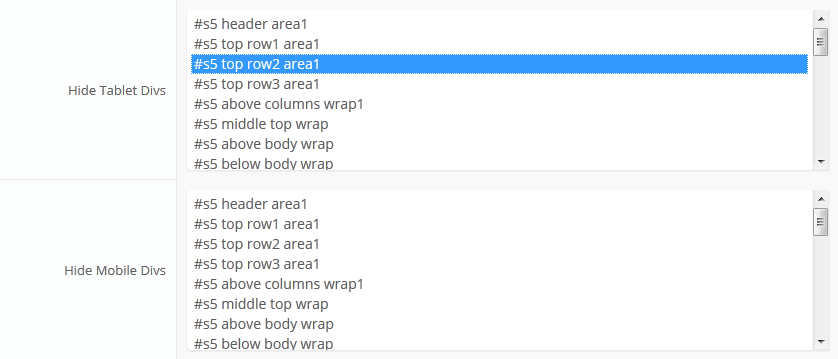
IMPORTANT - If you turn off a column position such as right or right_inset something else must be in the same column or the layout will not work. For example you can turn off right_inset and keep right, but you cannot turn off both unless something is publihsed to right_top or right_bottom as well.
Hide Specific Modules via the Hide Classes
If you have only a specific module that you would like to hide at certain screen sizes, and not an entire section of the template, this is the best approach. A hide class is a class that can be applied to any element on the page and hides that particular element at certain screen sizes. Classes range in 100px increments for large screens and 50px increments for small screens. Below are some examples, and at the very bottom of this page there is a list of all the available hide classes. Use these sparingly if you can. As a recommendation, the primary target of these classes should focus on tablet and mobile sized screens. Wide screen monitors vary in size so it's much harder to use these classes correctly for large monitors. Tablet and mobile devices are much more consistent in size so it is much easier to apply the smaller hide classes.For example, say you want to hide a specific module when the screen sizes reaches 900px wide, and remain hidden for any screen below 900px. Simply add class=hide_900 to the title of the module like this:
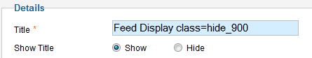
The class is simply put into the title of the module. There must be a space just before class= , and don't worry, the class area of the title won't actually show on the live site, it's only shown in the backend. It must be entered exactly as shown above. The title can be published or unpublished, it does not matter which. Simply adding the classes to the title will apply the classes to the entire module.
What if you want it to hide the module only for a certain range? That's easy just add _only to the end of the class name. hide_900_only will only hide that element from 900px to the next increment in the hide classes, which is 850px. So it will only be hidden from 850px to 900px. You can also add multiple classes to the title like this class=hide_900_only hide_850_only which will apply both classes to the module.
What if you want to hide the module and then show it again later? That's simple, use show_ in the class instead of hide_. This will make the module show for the specified size no matter what other settings are on the module. So if you want to hide the module from 1000px and below, but you want to show it again later then do something like the following class=hide_1000 show_600. This will hide the module from 600px to 1000px.
Is there a more simple way? Yes, of course, the above directions are for experienced users who want to tweak their content for every available screen size. If you don't want to mess around with specific window sizes simply use the following classes instead, which have preset screen sizes applied to them:
hide_all
hide_wide_screen
hide_standard_screen
hide_large_tablet
hide_small_tablet
hide_mobile
show_wide_screen
show_standard_screen
show_large_tablet
show_small_tablet
show_mobile
Why would someone use hide_all? This is a great tool for anyone wanting to show content only on a mobile or tablet sized screen but hide it on all other devices. To do this you should use class="hide_all show_mobile". The hide_all will set the content or module to display:none on all devices, and one the screen size reaches mobile size the show_mobile will override the display:none and show the content.
Hide Specific Content via the Hide Classes
If you have only specific content or images within an article or module that you want to hide then use the same hide classes described above, but wrap that specific content inside of the class instead of applying it to the entire module. For example, in the image below, the third paragraph will hide at 900px and then show again at 700px.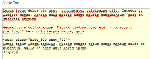
Available Hide Classes
All the available hide classes are listed below. Note there is a break at 970px and 580px to accommodate tablet and mobile sized screens. At the bottom of the list you will see inline calls, these calls should only be used if the default block calls cause a layout problem with your content, which can happen with applying a display:block./* HIDE CLASSES
----------------------------------------------------------- */
@media screen and (max-width: 1600px){
.hide_1600 {
display:none !important;
}
}
@media screen and (min-width:1500px) and (max-width: 1600px){
.hide_1600_only {
display:none !important;
}
}
@media screen and (max-width: 1550px){
.hide_1550 {
display:none !important;
}
}
@media screen and (min-width:1450px) and (max-width: 1550px){
.hide_1550_only {
display:none !important;
}
}
@media screen and (max-width: 1500px){
.hide_1500 {
display:none !important;
}
}
@media screen and (min-width:1400px) and (max-width: 1500px){
.hide_1500_only {
display:none !important;
}
}
@media screen and (max-width: 1450px){
.hide_1450 {
display:none !important;
}
}
@media screen and (min-width:1350px) and (max-width: 1450px){
.hide_1450_only {
display:none !important;
}
}
@media screen and (max-width: 1400px){
.hide_1400 {
display:none !important;
}
}
@media screen and (min-width:1300px) and (max-width: 1400px){
.hide_1400_only {
display:none !important;
}
}
@media screen and (max-width: 1350px){
.hide_1350 {
display:none !important;
}
}
@media screen and (min-width:1250px) and (max-width: 1350px){
.hide_1350_only {
display:none !important;
}
}
@media screen and (max-width: 1300px){
.hide_1300 {
display:none !important;
}
}
@media screen and (min-width:1200px) and (max-width: 1300px){
.hide_1300_only {
display:none !important;
}
}
@media screen and (max-width: 1250px){
.hide_1250 {
display:none !important;
}
}
@media screen and (min-width:1150px) and (max-width: 1250px){
.hide_1250_only {
display:none !important;
}
}
@media screen and (max-width: 1200px){
.hide_1200 {
display:none !important;
}
}
@media screen and (min-width:1100px) and (max-width: 1200px){
.hide_1200_only {
display:none !important;
}
}
@media screen and (max-width: 1150px){
.hide_1150 {
display:none !important;
}
}
@media screen and (min-width:1050px) and (max-width: 1150px){
.hide_1150_only {
display:none !important;
}
}
@media screen and (max-width: 1100px){
.hide_1100 {
display:none !important;
}
}
@media screen and (min-width:1000px) and (max-width: 1100px){
.hide_1100_only {
display:none !important;
}
}
@media screen and (max-width: 1050px){
.hide_1050 {
display:none !important;
}
}
@media screen and (min-width:950px) and (max-width: 1050px){
.hide_1050_only {
display:none !important;
}
}
@media screen and (max-width: 1000px){
.hide_1000 {
display:none !important;
}
}
@media screen and (min-width:900px) and (max-width: 1000px){
.hide_1000_only {
display:none !important;
}
}
@media screen and (max-width: 970px){
.hide_970 {
display:none !important;
}
}
@media screen and (min-width:900px) and (max-width: 970px){
.hide_970_only {
display:none !important;
}
}
@media screen and (max-width: 950px){
.hide_950 {
display:none !important;
}
}
@media screen and (min-width:900px) and (max-width: 950px){
.hide_950_only {
display:none !important;
}
}
@media screen and (max-width: 900px){
.hide_900 {
display:none !important;
}
}
@media screen and (min-width:850px) and (max-width: 900px){
.hide_900_only {
display:none !important;
}
}
@media screen and (max-width: 850px){
.hide_850 {
display:none !important;
}
}
@media screen and (min-width:800px) and (max-width: 850px){
.hide_850_only {
display:none !important;
}
}
@media screen and (max-width: 800px){
.hide_800 {
display:none !important;
}
}
@media screen and (min-width:750px) and (max-width: 800px){
.hide_800_only {
display:none !important;
}
}
@media screen and (max-width: 750px){
.hide_750 {
display:none !important;
}
}
@media screen and (min-width:700px) and (max-width: 750px){
.hide_750_only {
display:none !important;
}
}
@media screen and (max-width: 700px){
.hide_700 {
display:none !important;
}
}
@media screen and (min-width:650px) and (max-width: 700px){
.hide_700_only {
display:none !important;
}
}
@media screen and (max-width: 650px){
.hide_650 {
display:none !important;
}
}
@media screen and (min-width:600px) and (max-width: 650px){
.hide_650_only {
display:none !important;
}
}
@media screen and (max-width: 600px){
.hide_600 {
display:none !important;
}
}
@media screen and (min-width:580px) and (max-width: 600px){
.hide_600_only {
display:none !important;
}
}
@media screen and (max-width: 579px){
.hide_580 {
display:none !important;
}
}
@media screen and (min-width:550px) and (max-width: 579px){
.hide_580_only {
display:none !important;
}
}
.hide_all {
display:none ! important;
}
@media screen and (min-width:1300px) and (max-width: 50000px){
.hide_wide_screen {
display:none !important;
}
}
@media screen and (min-width:971px) and (max-width: 1299px){
.hide_standard_screen {
display:none !important;
}
}
@media screen and (min-width:750px) and (max-width: 970px){
.hide_large_tablet {
display:none !important;
}
}
@media screen and (min-width:580px) and (max-width: 750px){
.hide_small_tablet {
display:none !important;
}
}
@media screen and (min-width:580px) and (max-width: 750px){
.hide_small_tablet {
display:none !important;
}
}
@media screen and (max-width: 579px){
.hide_mobile {
display:none !important;
}
}
@media screen and (max-width: 1600px){
.show_1600 {
display:block !important;
}
}
@media screen and (min-width:1500px) and (max-width: 1600px){
.show_1600_only {
display:block !important;
}
}
@media screen and (max-width: 1550px){
.show_1550 {
display:block !important;
}
}
@media screen and (min-width:1450px) and (max-width: 1550px){
.show_1550_only {
display:block !important;
}
}
@media screen and (max-width: 1500px){
.show_1500 {
display:block !important;
}
}
@media screen and (min-width:1400px) and (max-width: 1500px){
.show_1500_only {
display:block !important;
}
}
@media screen and (max-width: 1450px){
.show_1450 {
display:block !important;
}
}
@media screen and (min-width:1350px) and (max-width: 1450px){
.show_1450_only {
display:block !important;
}
}
@media screen and (max-width: 1400px){
.show_1400 {
display:block !important;
}
}
@media screen and (min-width:1300px) and (max-width: 1400px){
.show_1400_only {
display:block !important;
}
}
@media screen and (max-width: 1350px){
.show_1350 {
display:block !important;
}
}
@media screen and (min-width:1250px) and (max-width: 1350px){
.show_1350_only {
display:block !important;
}
}
@media screen and (max-width: 1300px){
.show_1300 {
display:block !important;
}
}
@media screen and (min-width:1200px) and (max-width: 1300px){
.show_1300_only {
display:block !important;
}
}
@media screen and (max-width: 1250px){
.show_1250 {
display:block !important;
}
}
@media screen and (min-width:1150px) and (max-width: 1250px){
.show_1250_only {
display:block !important;
}
}
@media screen and (max-width: 1200px){
.show_1200 {
display:block !important;
}
}
@media screen and (min-width:1100px) and (max-width: 1200px){
.show_1200_only {
display:block !important;
}
}
@media screen and (max-width: 1150px){
.show_1150 {
display:block !important;
}
}
@media screen and (min-width:1050px) and (max-width: 1150px){
.show_1150_only {
display:block !important;
}
}
@media screen and (max-width: 1100px){
.show_1100 {
display:block !important;
}
}
@media screen and (min-width:1000px) and (max-width: 1100px){
.show_1100_only {
display:block !important;
}
}
@media screen and (max-width: 1050px){
.show_1050 {
display:block !important;
}
}
@media screen and (min-width:950px) and (max-width: 1050px){
.show_1050_only {
display:block !important;
}
}
@media screen and (max-width: 1000px){
.show_1000 {
display:block !important;
}
}
@media screen and (min-width:900px) and (max-width: 1000px){
.show_1000_only {
display:block !important;
}
}
@media screen and (max-width: 970px){
.show_970 {
display:block !important;
}
}
@media screen and (min-width:900px) and (max-width: 970px){
.show_970_only {
display:block !important;
}
}
@media screen and (max-width: 950px){
.show_950 {
display:block !important;
}
}
@media screen and (min-width:900px) and (max-width: 950px){
.show_950_only {
display:block !important;
}
}
@media screen and (max-width: 900px){
.show_900 {
display:block !important;
}
}
@media screen and (min-width:850px) and (max-width: 900px){
.show_900_only {
display:block !important;
}
}
@media screen and (max-width: 850px){
.show_850 {
display:block !important;
}
}
@media screen and (min-width:800px) and (max-width: 850px){
.show_850_only {
display:block !important;
}
}
@media screen and (max-width: 800px){
.show_800 {
display:block !important;
}
}
@media screen and (min-width:750px) and (max-width: 800px){
.show_800_only {
display:block !important;
}
}
@media screen and (max-width: 750px){
.show_750 {
display:block !important;
}
}
@media screen and (min-width:700px) and (max-width: 750px){
.show_750_only {
display:block !important;
}
}
@media screen and (max-width: 700px){
.show_700 {
display:block !important;
}
}
@media screen and (min-width:650px) and (max-width: 700px){
.show_700_only {
display:block !important;
}
}
@media screen and (max-width: 650px){
.show_650 {
display:block !important;
}
}
@media screen and (min-width:600px) and (max-width: 650px){
.show_650_only {
display:block !important;
}
}
@media screen and (max-width: 600px){
.show_600 {
display:block !important;
}
}
@media screen and (min-width:580px) and (max-width: 600px){
.show_600_only {
display:block !important;
}
}
@media screen and (max-width: 579px){
.show_580 {
display:block !important;
}
}
@media screen and (min-width:550px) and (max-width: 579px){
.show_580_only {
display:block !important;
}
}
@media screen and (min-width:1300px) and (max-width: 50000px){
.show_wide_screen {
display:block !important;
}
}
@media screen and (min-width:971px) and (max-width: 1299px){
.show_standard_screen {
display:block !important;
}
}
@media screen and (min-width:750px) and (max-width: 970px){
.show_large_tablet {
display:block !important;
}
}
@media screen and (min-width:580px) and (max-width: 750px){
.show_small_tablet {
display:block !important;
}
}
@media screen and (max-width: 579px){
.show_mobile {
display:block !important;
}
}
/* THE INLINE SHOW CALLS BELOW SHOULD BE USED SELDOMLY. THEY SHOULD ONLY BE USED
IF THE BLOCK SHOW CALLS ABOVE CAUSE A LAYOUT ISSUE WHEN TRIGGERED.
----------------------------------------------------------- */
@media screen and (max-width: 1600px){
.show_1600_inline {
display:inline !important;
}
}
@media screen and (min-width:1500px) and (max-width: 1600px){
.show_1600_only_inline {
display:inline !important;
}
}
@media screen and (max-width: 1550px){
.show_1550_inline {
display:inline !important;
}
}
@media screen and (min-width:1450px) and (max-width: 1550px){
.show_1550_only_inline {
display:inline !important;
}
}
@media screen and (max-width: 1500px){
.show_1500_inline {
display:inline !important;
}
}
@media screen and (min-width:1400px) and (max-width: 1500px){
.show_1500_only_inline {
display:inline !important;
}
}
@media screen and (max-width: 1450px){
.show_1450_inline {
display:inline !important;
}
}
@media screen and (min-width:1350px) and (max-width: 1450px){
.show_1450_only_inline {
display:inline !important;
}
}
@media screen and (max-width: 1400px){
.show_1400_inline {
display:inline !important;
}
}
@media screen and (min-width:1300px) and (max-width: 1400px){
.show_1400_only_inline {
display:inline !important;
}
}
@media screen and (max-width: 1350px){
.show_1350_inline {
display:inline !important;
}
}
@media screen and (min-width:1250px) and (max-width: 1350px){
.show_1350_only_inline {
display:inline !important;
}
}
@media screen and (max-width: 1300px){
.show_1300_inline {
display:inline !important;
}
}
@media screen and (min-width:1200px) and (max-width: 1300px){
.show_1300_only_inline {
display:inline !important;
}
}
@media screen and (max-width: 1250px){
.show_1250_inline {
display:inline !important;
}
}
@media screen and (min-width:1150px) and (max-width: 1250px){
.show_1250_only_inline {
display:inline !important;
}
}
@media screen and (max-width: 1200px){
.show_1200_inline {
display:inline !important;
}
}
@media screen and (min-width:1100px) and (max-width: 1200px){
.show_1200_only_inline {
display:inline !important;
}
}
@media screen and (max-width: 1150px){
.show_1150_inline {
display:inline !important;
}
}
@media screen and (min-width:1050px) and (max-width: 1150px){
.show_1150_only_inline {
display:inline !important;
}
}
@media screen and (max-width: 1100px){
.show_1100_inline {
display:inline !important;
}
}
@media screen and (min-width:1000px) and (max-width: 1100px){
.show_1100_only_inline {
display:inline !important;
}
}
@media screen and (max-width: 1050px){
.show_1050_inline {
display:inline !important;
}
}
@media screen and (min-width:950px) and (max-width: 1050px){
.show_1050_only_inline {
display:inline !important;
}
}
@media screen and (max-width: 1000px){
.show_1000_inline {
display:inline !important;
}
}
@media screen and (min-width:900px) and (max-width: 1000px){
.show_1000_only_inline {
display:inline !important;
}
}
@media screen and (max-width: 970px){
.show_970_inline {
display:inline !important;
}
}
@media screen and (min-width:900px) and (max-width: 970px){
.show_970_only_inline {
display:inline !important;
}
}
@media screen and (max-width: 950px){
.show_950_inline {
display:inline !important;
}
}
@media screen and (min-width:900px) and (max-width: 950px){
.show_950_only_inline {
display:inline !important;
}
}
@media screen and (max-width: 900px){
.show_900_inline {
display:inline !important;
}
}
@media screen and (min-width:850px) and (max-width: 900px){
.show_900_only_inline {
display:inline !important;
}
}
@media screen and (max-width: 850px){
.show_850_inline {
display:inline !important;
}
}
@media screen and (min-width:800px) and (max-width: 850px){
.show_850_only_inline {
display:inline !important;
}
}
@media screen and (max-width: 800px){
.show_800_inline {
display:inline !important;
}
}
@media screen and (min-width:750px) and (max-width: 800px){
.show_800_only_inline {
display:inline !important;
}
}
@media screen and (max-width: 750px){
.show_750_inline {
display:inline !important;
}
}
@media screen and (min-width:700px) and (max-width: 750px){
.show_750_only_inline {
display:inline !important;
}
}
@media screen and (max-width: 700px){
.show_700_inline {
display:inline !important;
}
}
@media screen and (min-width:650px) and (max-width: 700px){
.show_700_only_inline {
display:inline !important;
}
}
@media screen and (max-width: 650px){
.show_650_inline {
display:inline !important;
}
}
@media screen and (min-width:600px) and (max-width: 650px){
.show_650_only_inline {
display:inline !important;
}
}
@media screen and (max-width: 600px){
.show_600_inline {
display:inline !important;
}
}
@media screen and (min-width:580px) and (max-width: 600px){
.show_600_only_inline {
display:inline !important;
}
}
@media screen and (max-width: 579px){
.show_580_inline {
display:inline !important;
}
}
@media screen and (min-width:550px) and (max-width: 579px){
.show_580_only_inline {
display:inline !important;
}
}
@media screen and (min-width:1300px) and (max-width: 50000px){
.show_wide_screen_inline {
display:inline !important;
}
}
@media screen and (min-width:971px) and (max-width: 1299px){
.show_standard_screen_inline {
display:inline !important;
}
}
@media screen and (min-width:750px) and (max-width: 970px){
.show_large_tablet_inline {
display:inline !important;
}
}
@media screen and (min-width:580px) and (max-width: 750px){
.show_small_tablet_inline {
display:inline !important;
}
}
@media screen and (max-width: 579px){
.show_mobile_inline {
display:inline !important;
}
}
Hide Article Component Area
- Details
- Created on Sunday, 12 May 2013 03:36
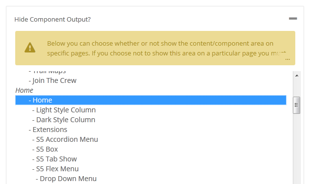
Below is a screenshot of this function from the configuration page, found under the General tab:
Google Fonts Enabled
- Details
- Created on Sunday, 12 May 2013 03:35
Fixed Side Tabs
- Details
- Created on Sunday, 12 May 2013 03:35
The following is a quick list of features:
- Change background to any hex color
- Change the border to any hex color
- Change the font to any hex color
- Set vertical position of each tab
- Set the height of each tab
- Set each tab to either the left or right of the screen
- Add a class to each fixed tab to enable s5 box or perhaps a lightbox or other 3rd party extension
- Add a URL to each fixed tab so onclick the URL loads
- Enter any text you desire

We had the best vacation we have ever had
“Lorem ipsum dolor sit amet, consectetur adipiscing elit. Nullam molestie mi a nunc porta facilisis. Mauris varius volutpat interdum. In quis congue velit, sit amet.” // Matt and Trish Green
The booking process was relaxed and easy
“Duis accumsan dignissim leo, eu facilisis sem aliquet eleifend. Duis viverra interdum est. Cras ut rhoncus sapien. Sed volutpat quis mauris nec sodales donec orci tellus” // Chris and Emily MeyersFind Deals On Cruises

Book The Perfect Cruise
Lorem ipsum dolor sit amet, consectetur adipiscing elit. Nullam molestie mi a nunc porta facilisis. Mauris varius volutpat interdum. In quis congue velit, orci, egestas in egestas eu, lacinia id sem.Cheap Air Line Tickets

Discount Airline Tickets
Ut non massa quis sapien ullamcorper posuere. Fusce vel lorem non ligula pellentesque elementum vel ut lacus. Nam ligula urna, vestibulum non odio id, sollicitudin tempus est. Fusce imperdiet vel.Fun Recreational Activities

Find Things To Do
Sed pretium metus condimentum, adipiscing elit placerat, tempor ligula. Curabitur accumsan turpis dui, vitae rhoncus quam bibendum ac. Aenean dignissim urna nisi, eu porttitor mauris tristique eu.Budget Car Rental Sales
Nice Cars On Budget
Lorem ipsum dolor sit amet, consectetur adipiscing elit. Nullam molestie mi a nunc porta facilisis. Mauris varius volutpat interdum. In quis congue velit, orci, egestas in egestas eu, lacinia id sem.Quiet Beaches Of The World
Little Known Beaches
Sed pretium metus condimentum, adipiscing elit placerat, tempor ligula. Curabitur accumsan turpis dui, vitae rhoncus quam bibendum ac. Aenean dignissim urna nisi, eu porttitor mauris tristique eu.